

Zest / Discovering new flavour terrains…


When Zest Coffee first broke into the specialty coffee market we forged a design brief that sat in the middle ground of specialty coffee. Nothing too fancy, nothing too effecting. The result, a pretty standard blue bag and a solid single letter Z. Neither said anything too ground breaking.
Back then we lacked the confidence in our place within the specialty coffee community, so we preferred to sit quietly with our design and let the coffee speak for itself.
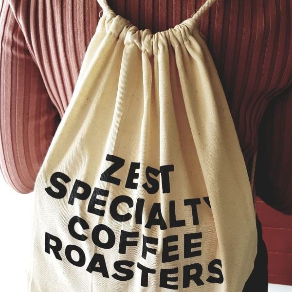
But, with the accomplishments and accolades of the past few years, which have positioned Zest as one of the industry standouts, our approach to marketing has changed somewhat. And when we sat down with leading Melbourne design studio Pop&Pac, the creative genius’s behind Bourke Streets stunning, Higher Ground café’s image, we had a much bolder vision for where we wanted to take our brand.
One clear pathway was into the future.
The rest we will unpack for you now.
Where the brand design stands today tells a much bigger story for Zest.
The Zest brand is a story of a company that has kept its pillars of an inclusive, open and thorough service from years of experience in the hospitality industry, and built upon them with a reputation for innovative, gutsy and creative coffee and community projects.
The strongest message we wanted to translate with our brand is that we are a company that firmly believes in balance.
You’ll see this represented, sometimes subtly, sometimes quite boldly, by a diagonal line. The diagonal line helps to tell the narrative of the many different sides to coffee production, sometimes polarised by the audience––between those who want to know everything about the coffee, and those who just ‘love a good cup’, sometimes just the two different sides to a story of a coffee, and sometimes it might represent the balance of the flavour we pride ourselves on reaching with our roast profiles.
The diagonal is ingrained in our brand story, just as balance is. The balance of our personal values as a company––how we balance experience with exploration, innovation with tradition, and of course the balance of culture and place, which as a roaster founded in a city like Melbourne plays a huge part of our journey.
The diagonal line also pays homage to our trusty old Z, which reminds us the strong foundations on which the ever-evolving, progressive company we know and love today were created.
The next component to our design, which will probably become the most recognisable into the future are our flavour terrains.
Pop&Pac cleverly blended and developed our beloved concepts behind the micro-lot infographics and the Espressist series still life, flavour profile shots (remember the gooey chocolate, cream and berry delicious mess of our African Mailman Espressist identity?)
The flavour terrain wallpaper use carefully developed keys to create patterns with depth and texture that represent elements of a coffee such as origin, flavour notes, geography, and topography. Each Zest product has its own unique pattern.
The brand has been very particularly designed to express the refinement of our brand over the years. You’ll notice gold foil print, which represents where we sit in the market, as result of fastidious processes developed among the team that honour each step of the quest for consistency. We know there’s no shortcut to optimal flavour. And we know there’s no purpose without it.
It is a brand that is comfortable with its future.
Minimal, refined and progressive.
But it is also a company that is proud of its past.
And a company that will try its hardest to translate the journey to anyone who is keen to learn.
To discover flavour terrains, to find the balance and to explore the future of specialty coffee.
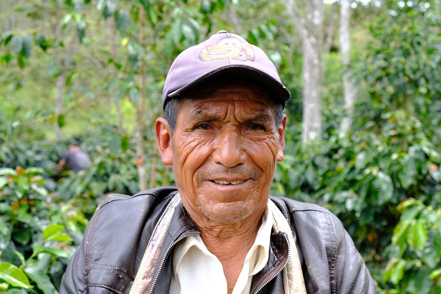
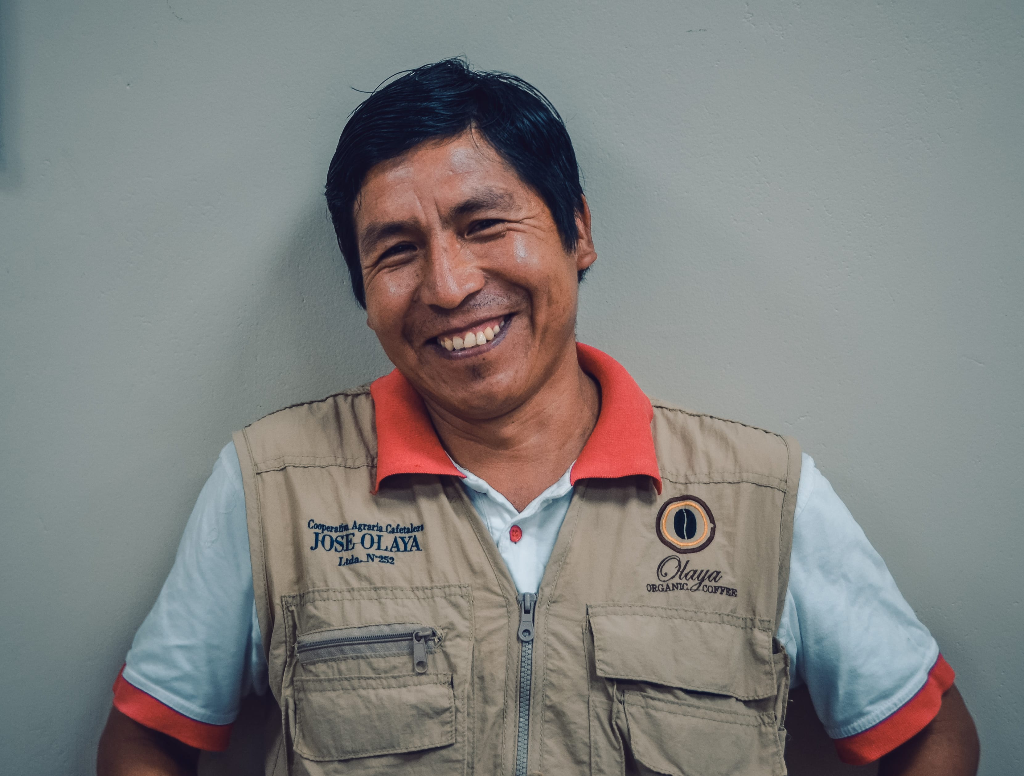
Zest are innovators, educators and explorers, but fore mostly we are a family, and we treat each of our customers –– from new café owner, corporate partner, meticulous brewer, intuitive home barista –– as we treat our own; friendly, approachable, reliable, informed. Relationships are important to Zest; connections built with coffee farmers and coffee drinkers are valued equally.
Zest are the perfect balance for Coffeekind.